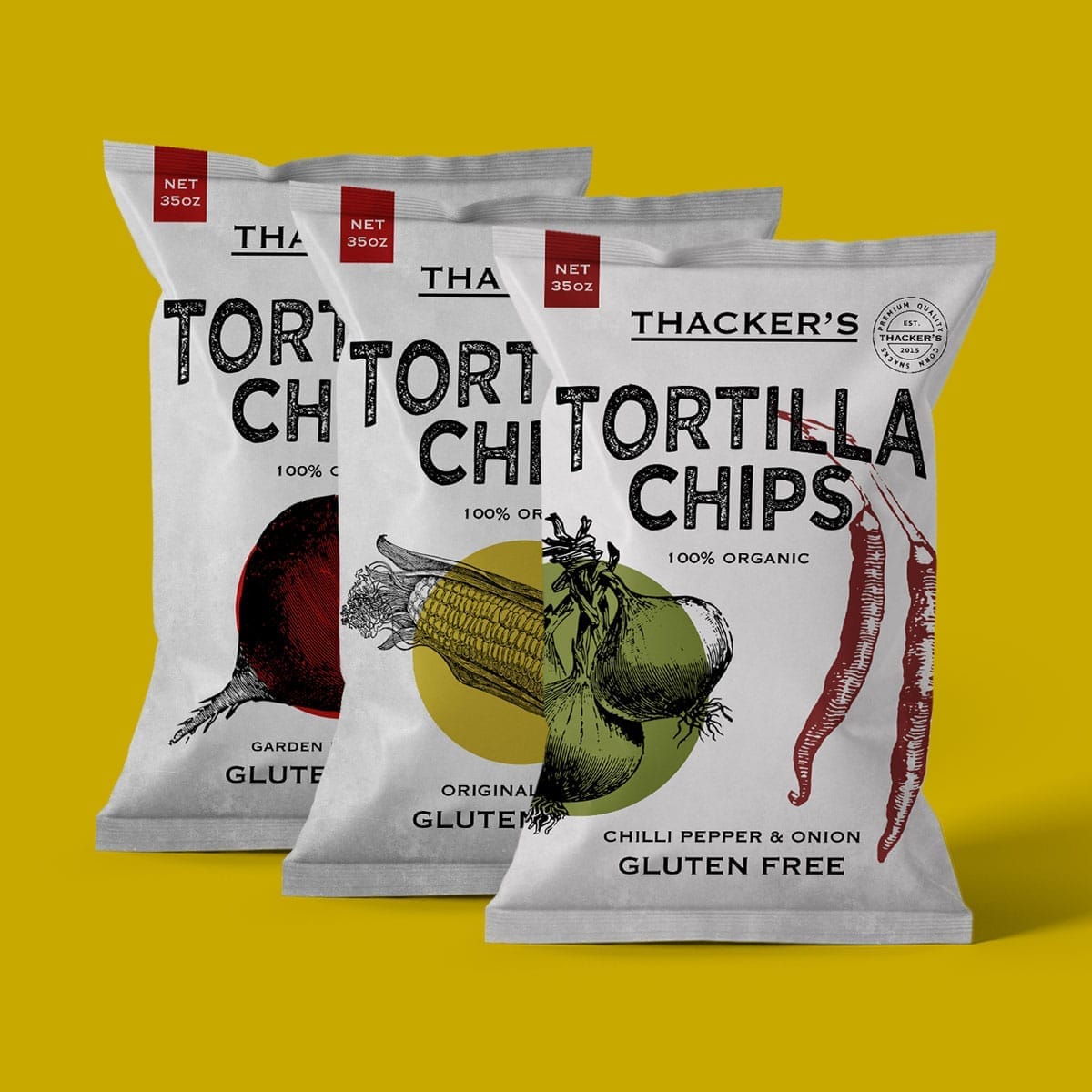
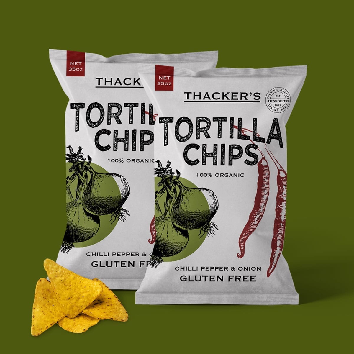
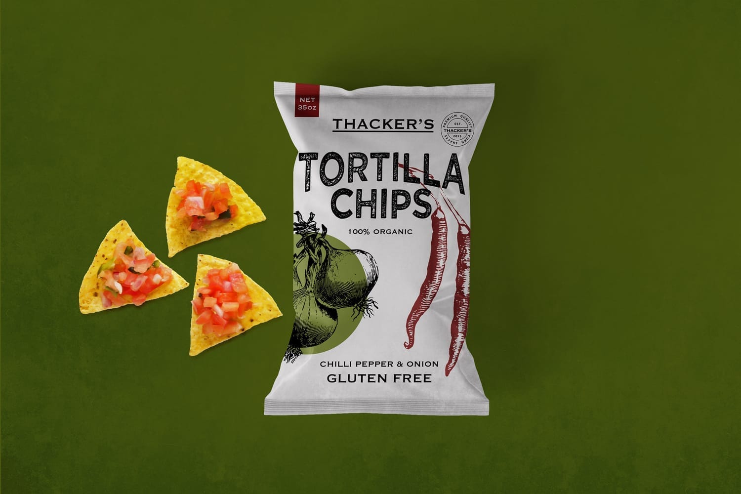
Thacker's Tortilla Chips: Cutting through the noise
We developed a strategic FMCG packaging design concept for Thacker’s Tortilla Chips — a premium, health-conscious snack brand created to stand out in a crowded retail environment. The aim was to create a visual identity that highlights natural ingredients, reflects the bold, no-nonsense character of the product, and communicates confidence at a glance.
The identity uses a pared-back, eye-catching design that balances clarity with modern, premium appeal, allowing the ingredients to take centre stage while ensuring the brand stands out on shelf.

Understated confidence
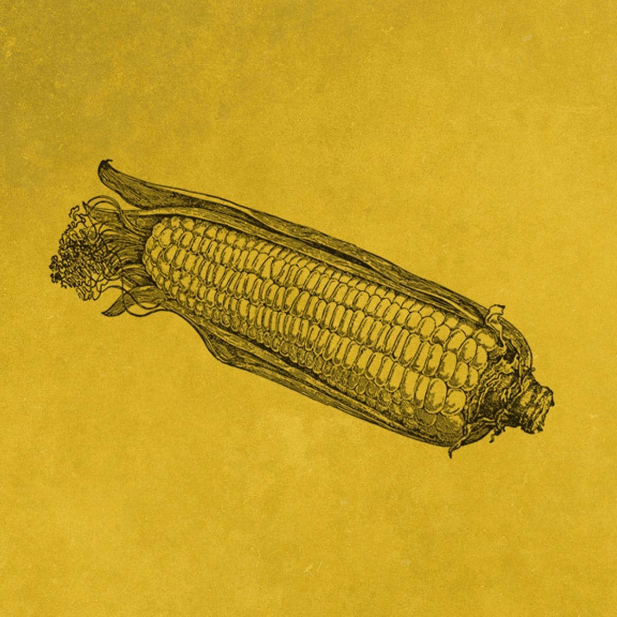
The focus of the concept is on the hero vegetables, emphasising their vibrancy and natural appeal. In a category dominated by loud, cluttered packaging, restraint becomes a strategic tool — creating a high-quality, approachable look that differentiates the brand while remaining true to its wholesome character.
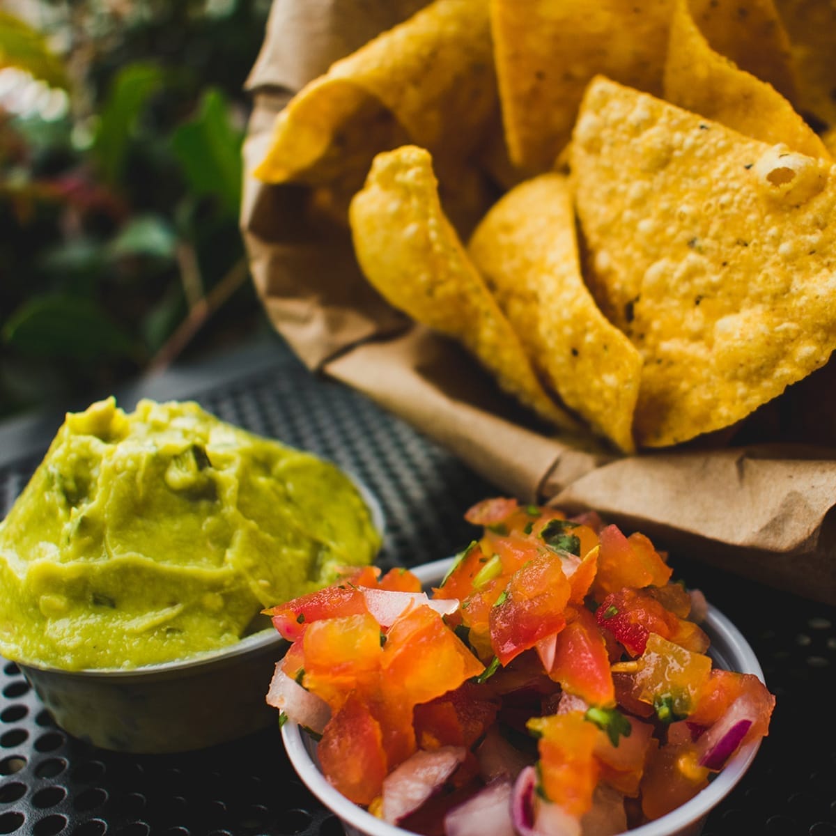
Real ingredients, real taste

Neutral, natural and unapologetically honest
A neutral palette provides a clean backdrop for bold typography and iconic graphics, conveying craftsmanship and clarity. Accent colours highlight each flavour profile sparingly, maintaining a cohesive, modern aesthetic that communicates both simplicity and attention to detail.
This approach reinforces the premium positioning while keeping the visual language approachable and rooted in natural ingredients.


Letting simplicity shine through
Simplicity is treated as a strategic strength, guiding the hierarchy, layout, and design elements. By focusing on the natural beauty of the ingredients, the concept communicates flavour, quality, and authenticity without clutter or embellishment. Every element is considered to support clarity, impact, and retail visibility.
The resulting FMCG snack packaging design presents a refined, confident visual identity that allows the product to speak for itself while showcasing Brave by Design’s expertise in branding for retail. It conveys natural quality, flavour integrity, and premium positioning, while ensuring the brand makes a strong impression in a highly competitive retail landscape.
Launch. Scale. Win shelf space.
Let’s take your brand where it belongs.

Helping you get your product onto shelves + into baskets.