SugarSin: Sweet, stylish and full of joy
SugarSin, a beloved name in indulgent confectionery with a flagship store and distribution through multiple retailers, approached us to refresh their packaging design. The challenge was to create a system that elevated the brand’s presence both on-shelf and in-store, strengthened its high-end positioning, and retained the playful, joyful personality that customers love, while ensuring the products stand out across a competitive confectionery market.
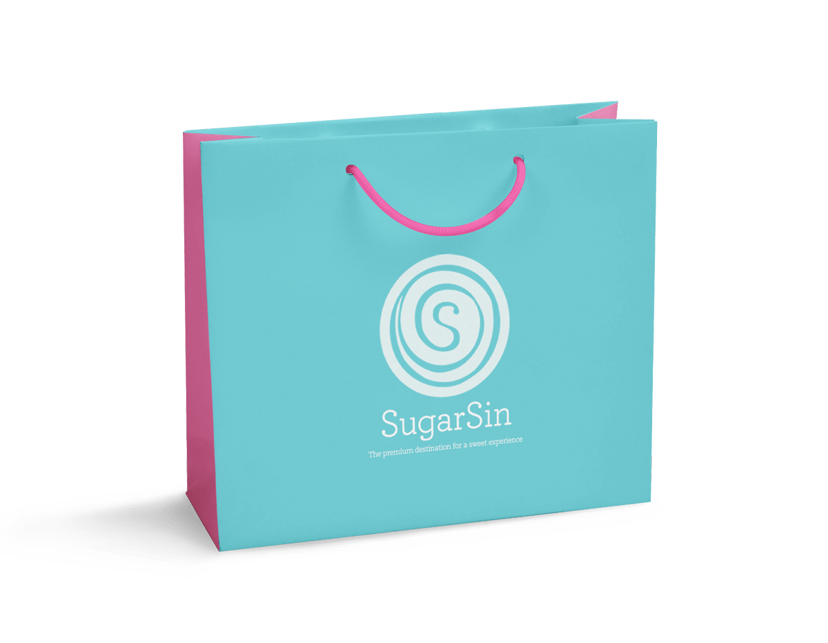
The premium destination for a sweet experience
We began by diving deep into SugarSin’s values, audience, and competitive landscape. This research highlighted a clear strategic opportunity: positioning SugarSin as “The premium destination for a sweet experience.” The tagline guided the design, ensuring every element reinforced the brand’s mission to deliver high-quality, joy-filled indulgence.
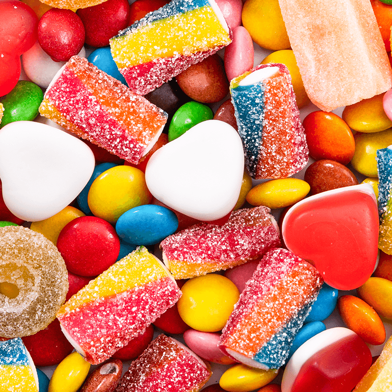
Fabulous, flavoursome, fun
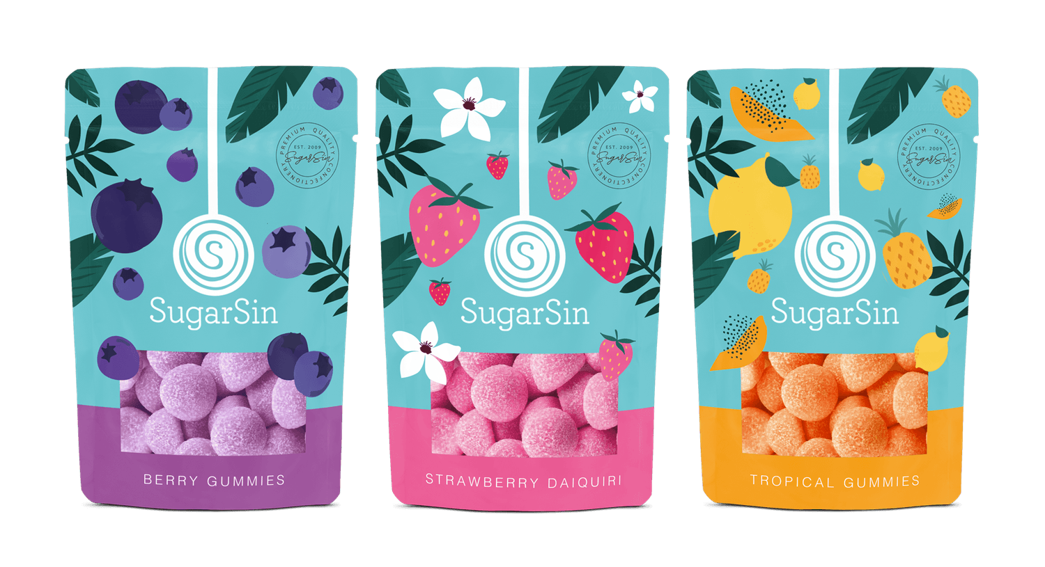
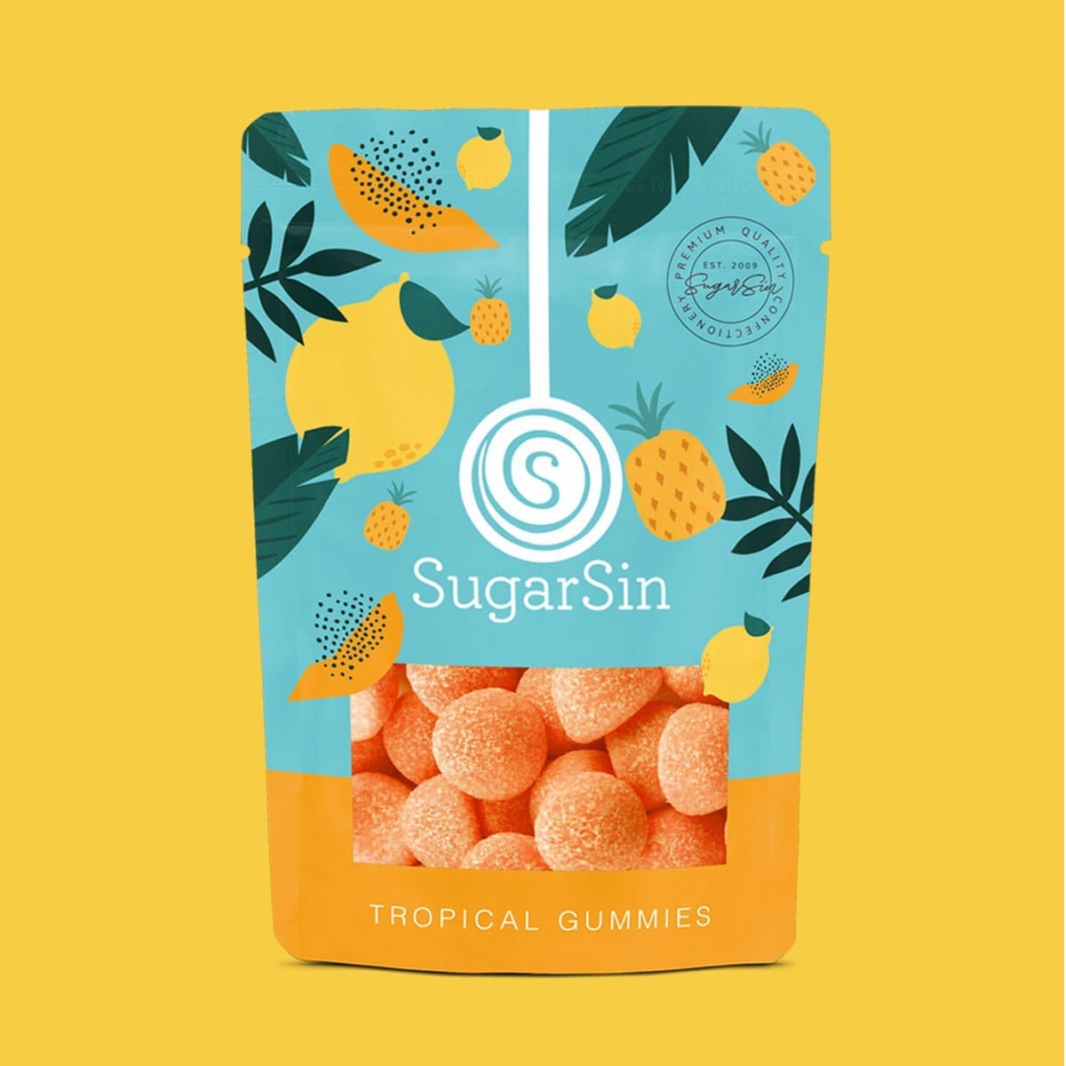
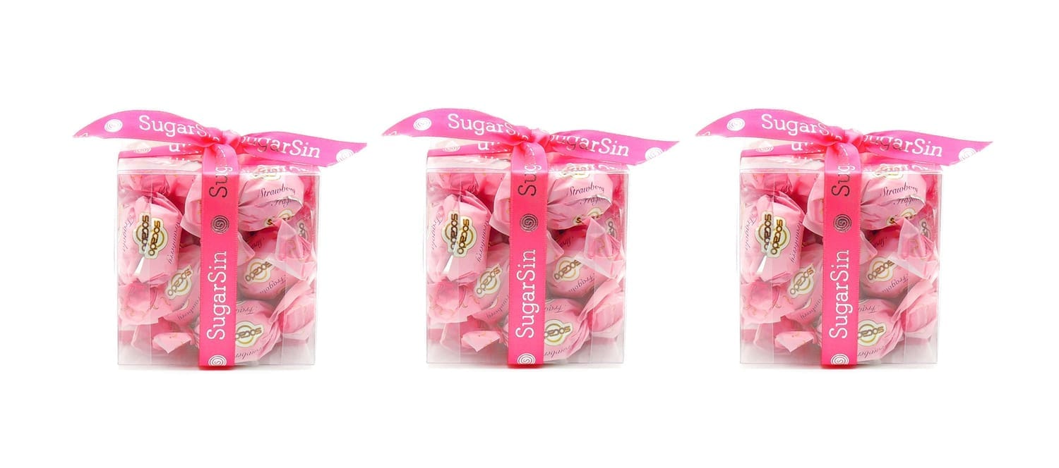
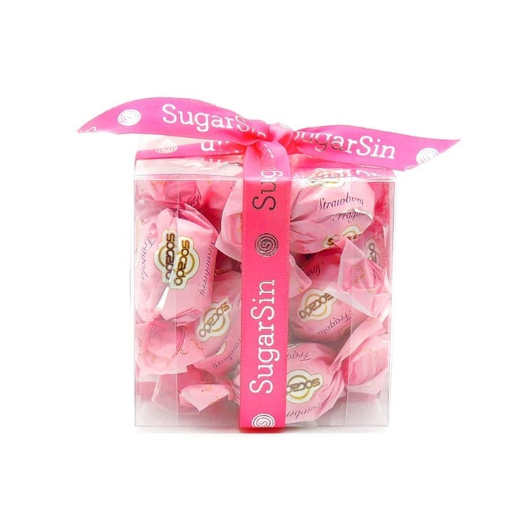
To translate this strategy into design, we developed a packaging system that balanced sophistication with playful energy. A carefully selected colour palette and brand accents enhanced shelf presence, while a mix of modern and playful imagery maintained a sense of elegance without losing approachability. Each product within the range was designed to feel individually enticing while contributing to a cohesive overall brand identity.
Boutique to supermarket, one sweet story
The result is a packaging concept that positions SugarSin as a standout in the FMCG confectionery category. By marrying standout visual cues with joyful design elements, the refreshed system communicates quality, indulgence, and delight, helping SugarSin strengthen its retail presence, connect with new audiences, and secure premium shelf impact across markets.
Launch. Scale. Win shelf space.
Let’s take your brand where it belongs.

Helping you get your product onto shelves + into baskets.