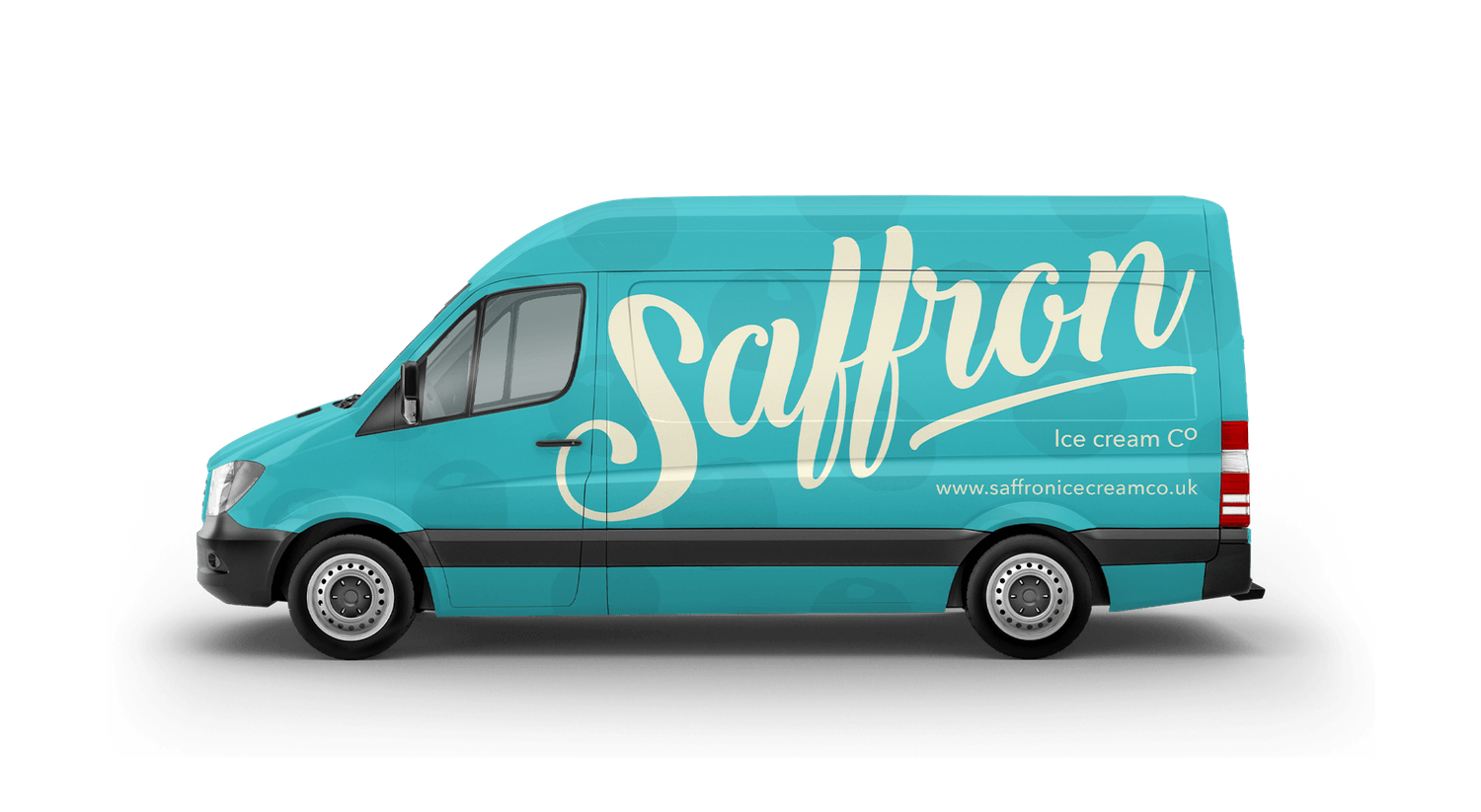
Saffron Ice Cream: Colour that pops, memories that last
We partnered with Saffron Ice Cream on a brand strategy and FMCG packaging design project, developing creative concepts to explore how their identity could evolve. Their vision was to refresh the brand and expand into new consumer markets, while staying true to their roots of using natural, locally sourced ingredients.
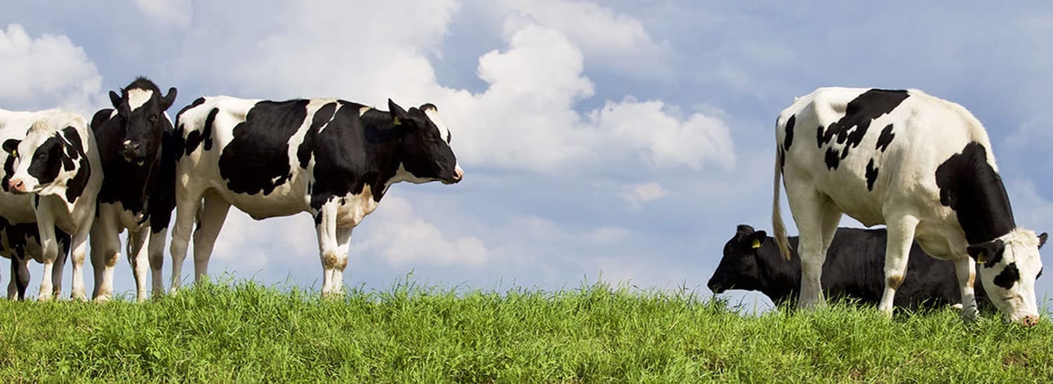
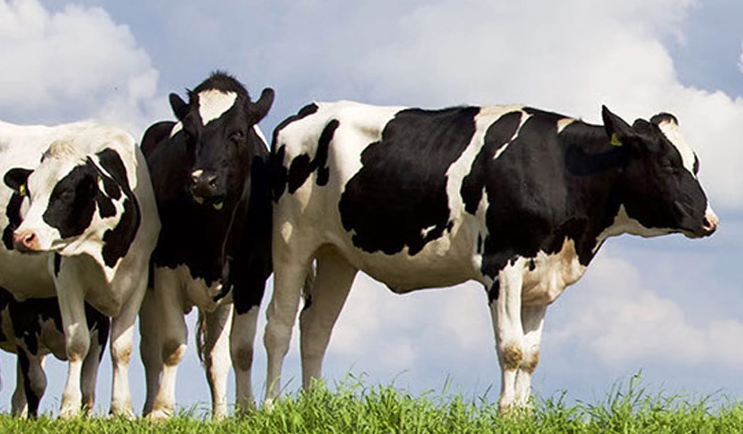
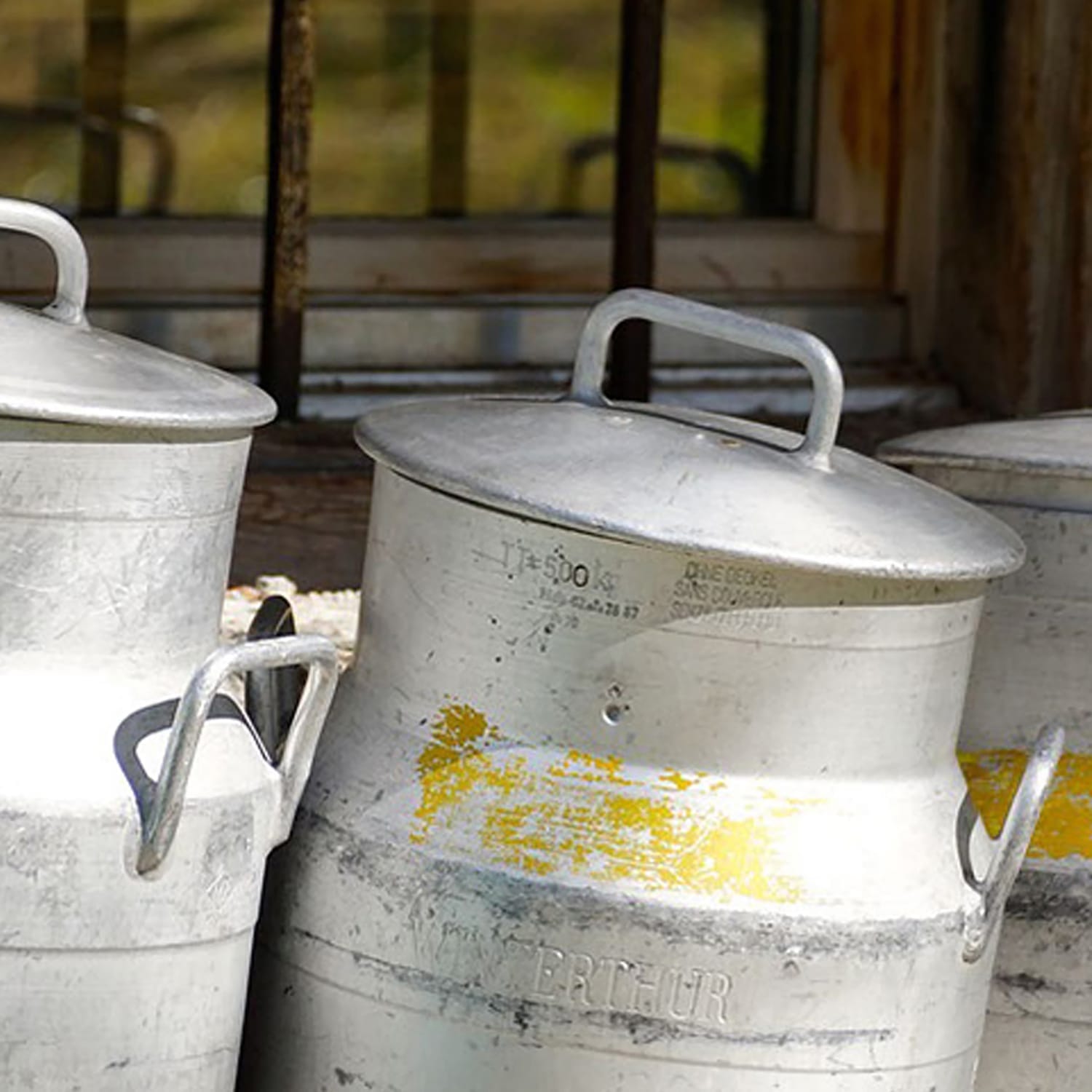
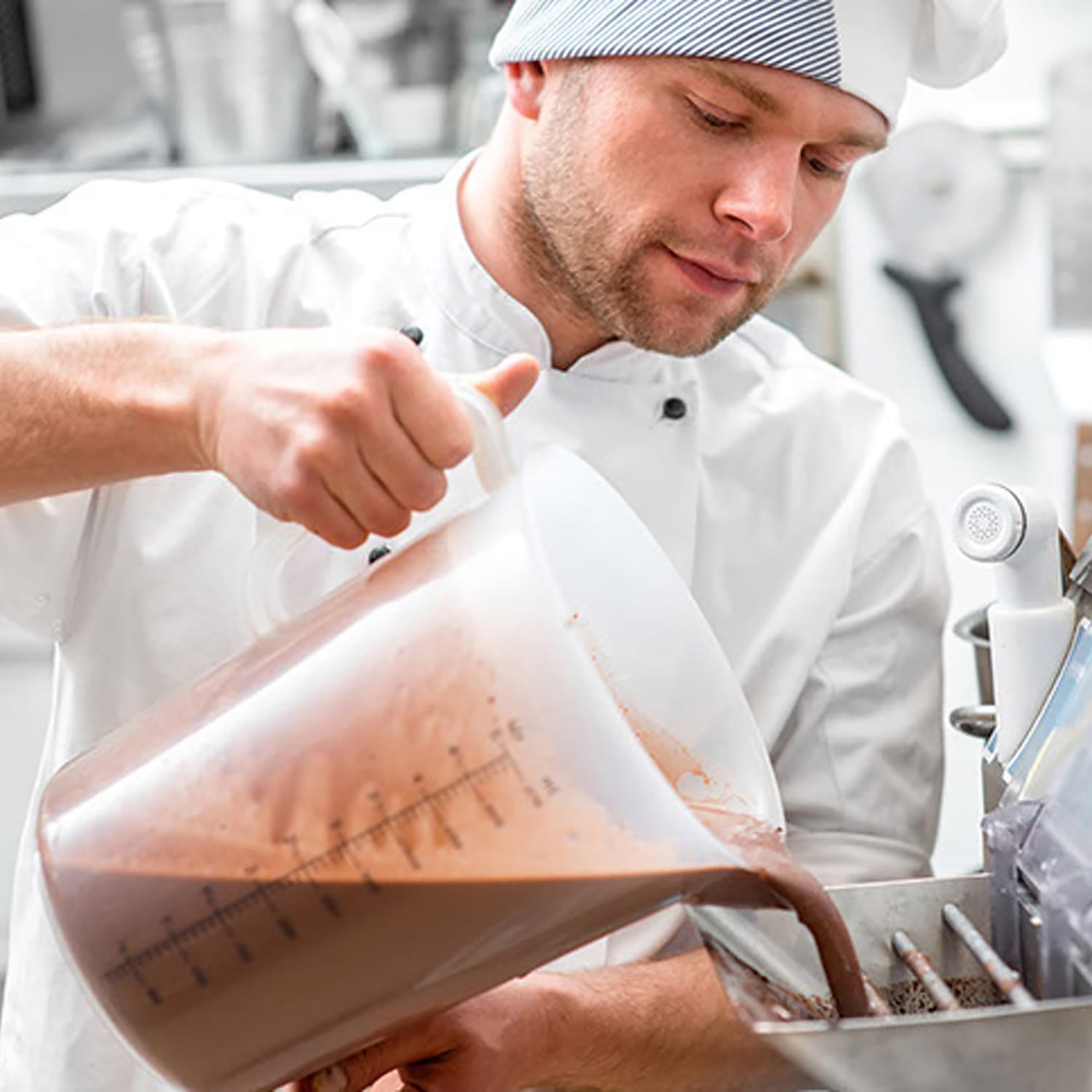
With their award-winning flavours hand-made by artisans in a rural Essex barn, the challenge was to create a visual identity that reflected the unique character of their ice creams, while positioning them as a new premium product in the retail market.
Lovingly handmade
Saffron Ice Cream Co. has always stood out for its commitment to quality, with a focus on handmade, small-batch production using locally sourced ingredients. Despite their exceptional products, the brand’s identity needed a refresh to appeal to a broader and more discerning consumer market.
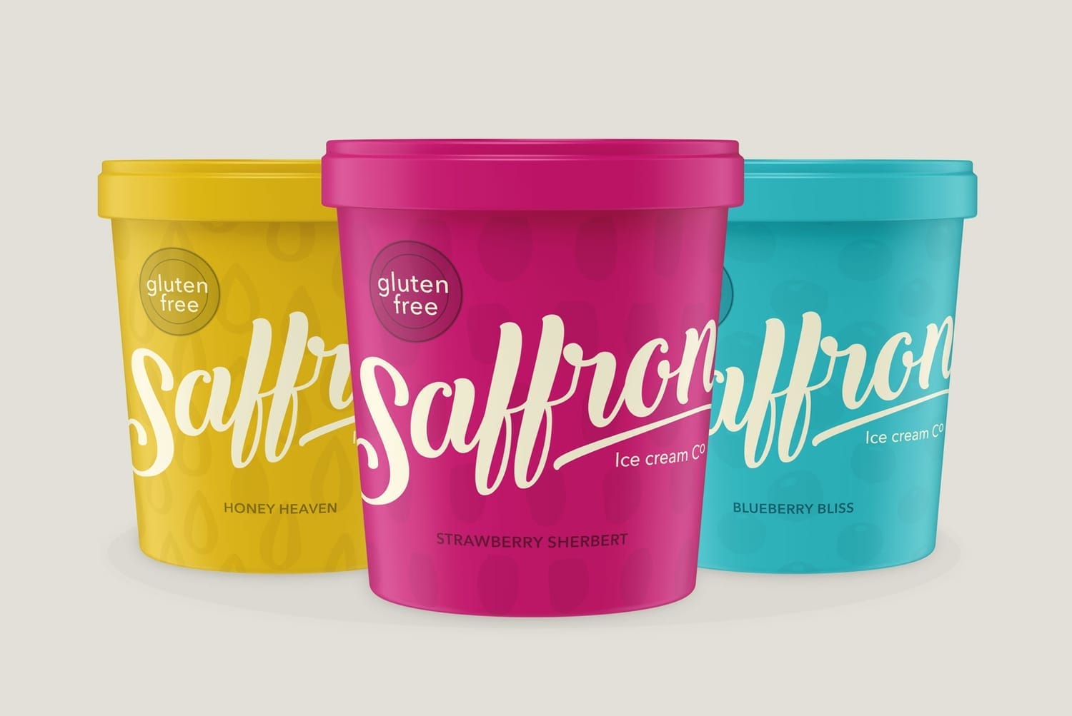
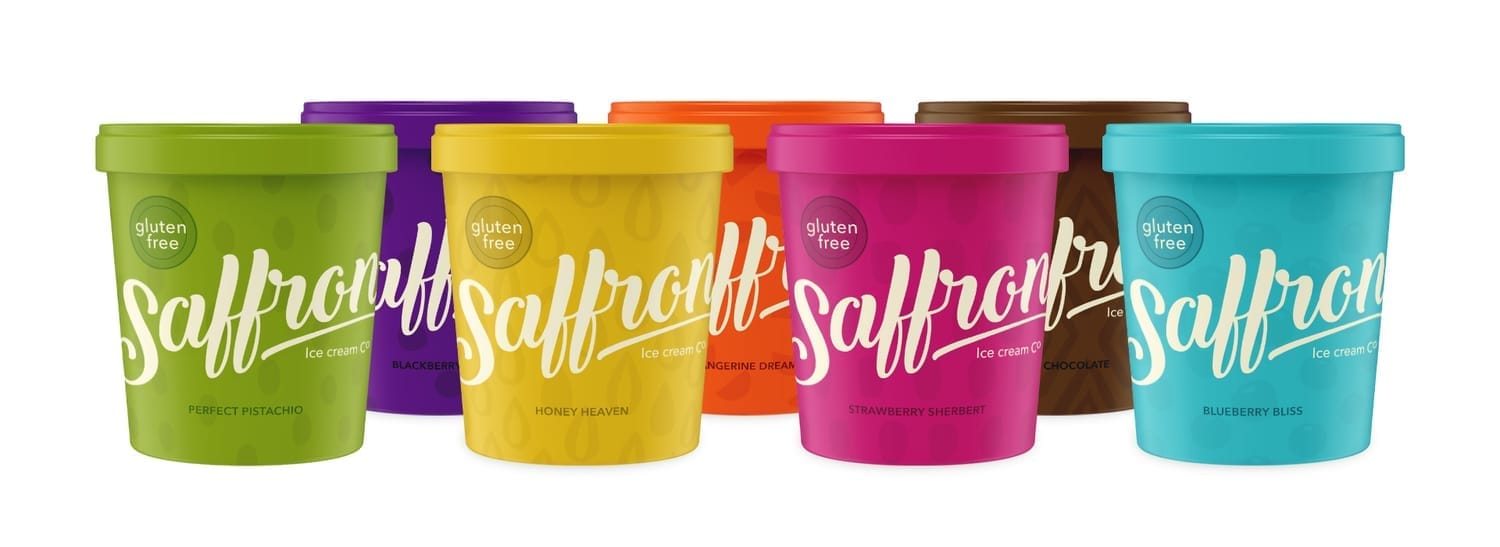
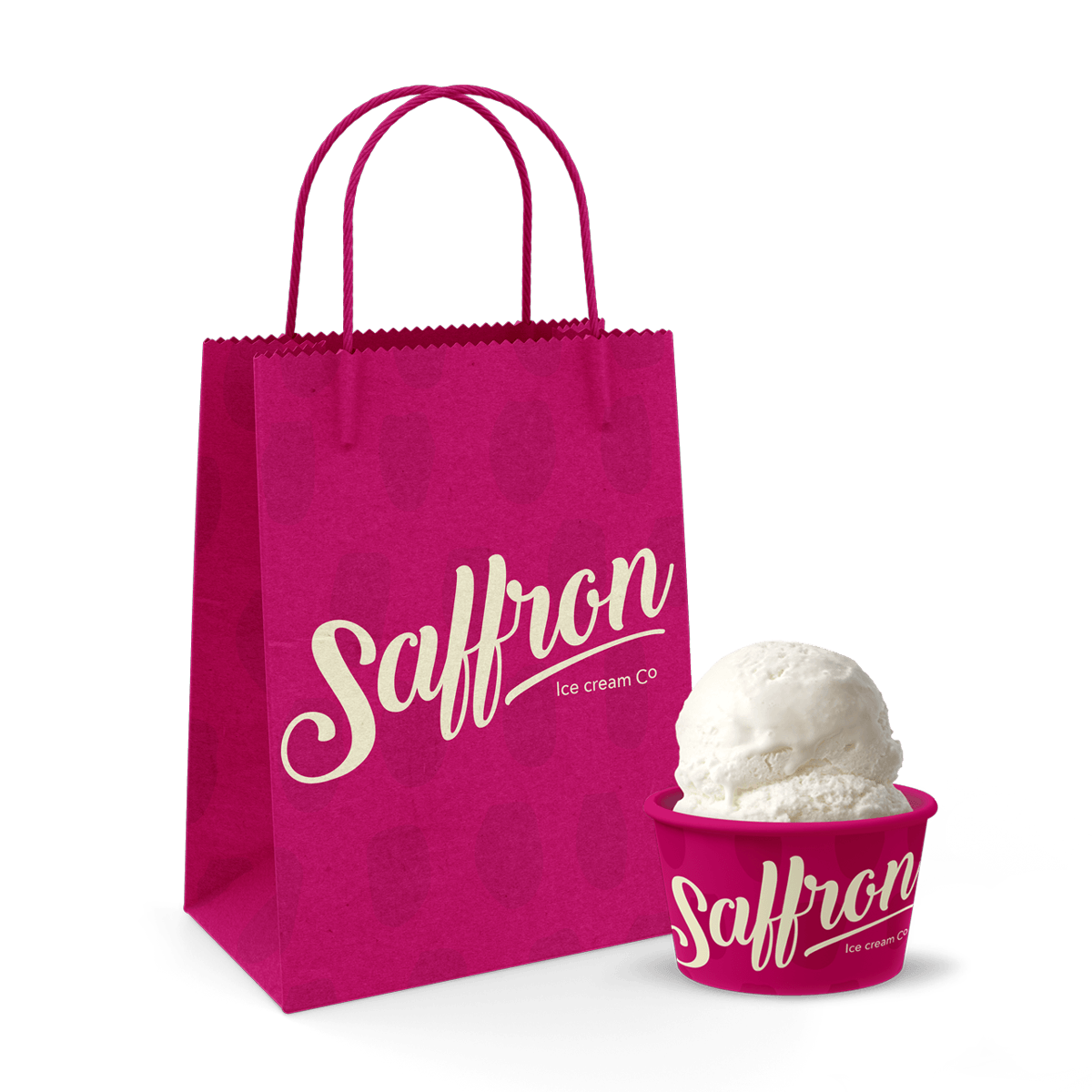
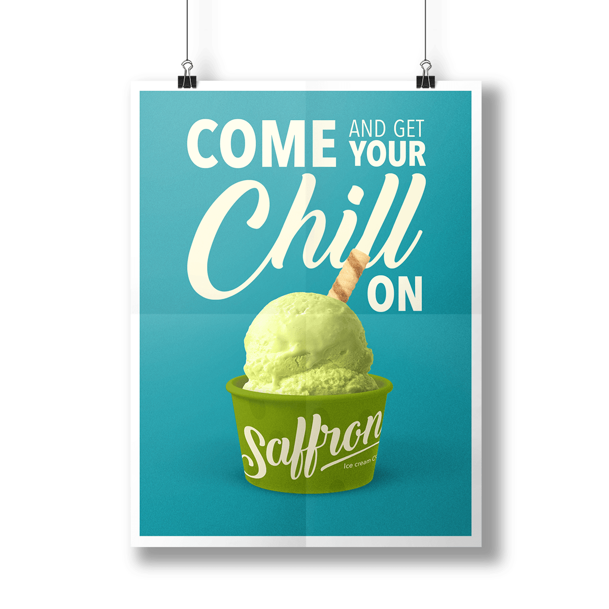
Our role was to develop a set of design concepts that honoured the artisanal quality of the ice cream while giving the brand the bold, contemporary presence it needed on shelf. To strike that balance, we introduced vibrant, impactful colour palettes paired with hand-drawn, modern patterns that subtly reference the local fruit ingredients. This combination allowed the brand to signal authenticity and craft, while still feeling fresh, premium, and retail-ready.
Guaranteed happiness in every tub
A premium, memorable brand experience
To bring the brand to life on pack, we designed a visual system where every element reflects the sensory qualities of the ice cream itself. Fluid typography was chosen to echo the creamy, indulgent texture of each scoop, while vibrant colour palettes create strong shelf presence and flavour differentiation.
Hand-drawn patterns, inspired by local fruit ingredients, add a layer of authenticity and detail without losing the modern, premium feel. The result is a design language that doesn’t just decorate the packaging — it tells a story of craft, flavour, and quality in a way that feels bold, contemporary, and retail-ready.


Stopping shoppers in their tracks
The work highlights how Saffron Ice Cream stands out on crowded shelves. Vibrant colour, fluid typography, and distinctive patterns bring the brand to life, reflecting flavour, quality, and authenticity. The visual identity and packaging system, developed by Brave by Design, helps communicate the brand’s premium positioning while providing a strong foundation for future packaging and marketing.
Launch. Scale. Win shelf space.
Let’s take your brand where it belongs.

Helping you get your product onto shelves + into baskets.