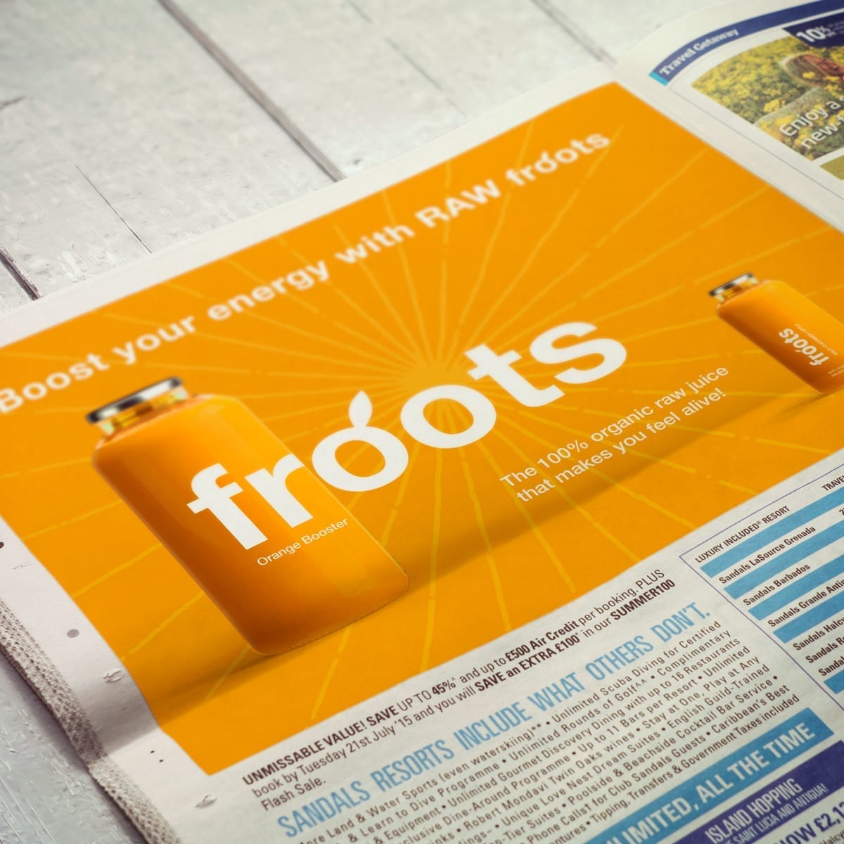
Froots Raw Juice: A fresh and natural identity
We developed a strategic concept for Froots Raw Organic Juice, exploring how a bold, natural identity could help them stand out in a crowded category. The challenge was to capture the brand’s commitment to vitality and freshness while creating a look that would engage health-conscious consumers seeking honesty and energy in their everyday choices.


Nature's goodness, bottled
Our starting point was to position Froots as more than another juice brand — instead, as a symbol of natural vitality. The strategy centred on showcasing purity of ingredients, the health benefits of raw juice, and the brand’s mission to make wholesome living accessible. This set the foundation for a concept identity rooted in nature’s vibrancy and energy.
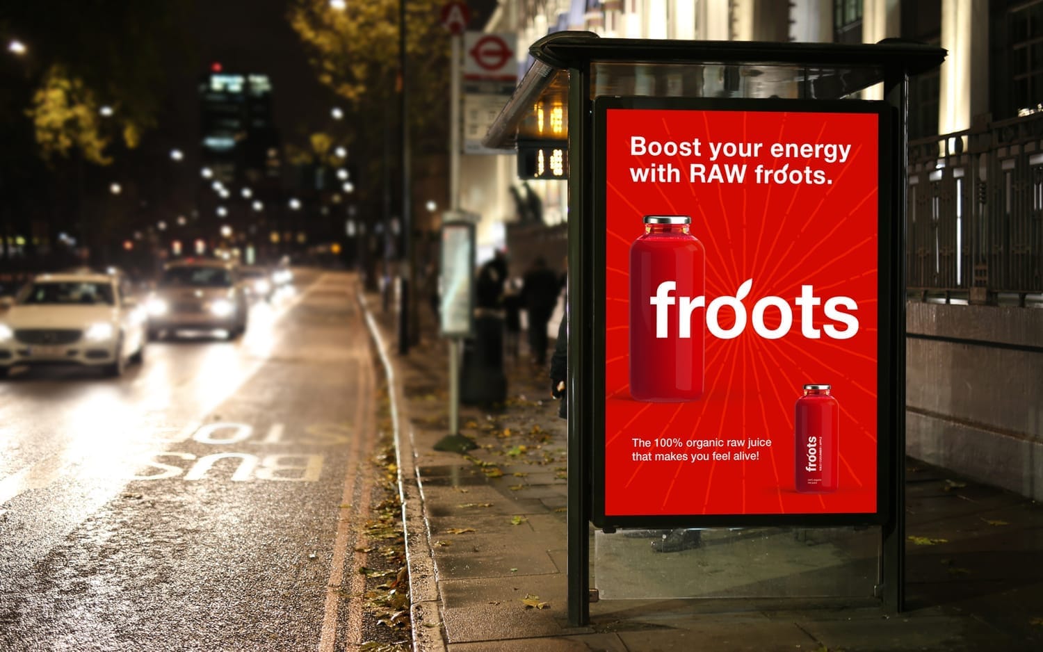
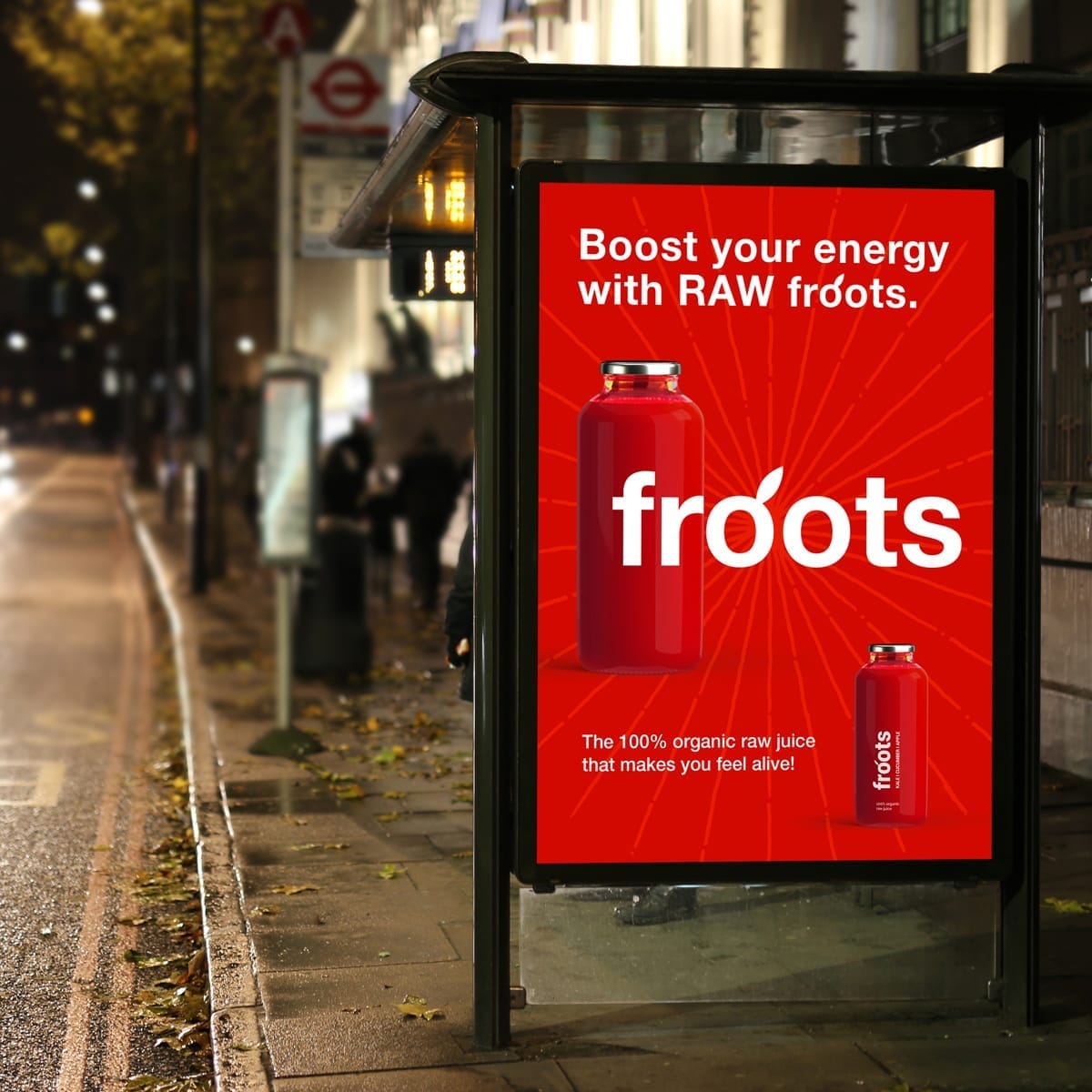
Boost your energy with raw froots
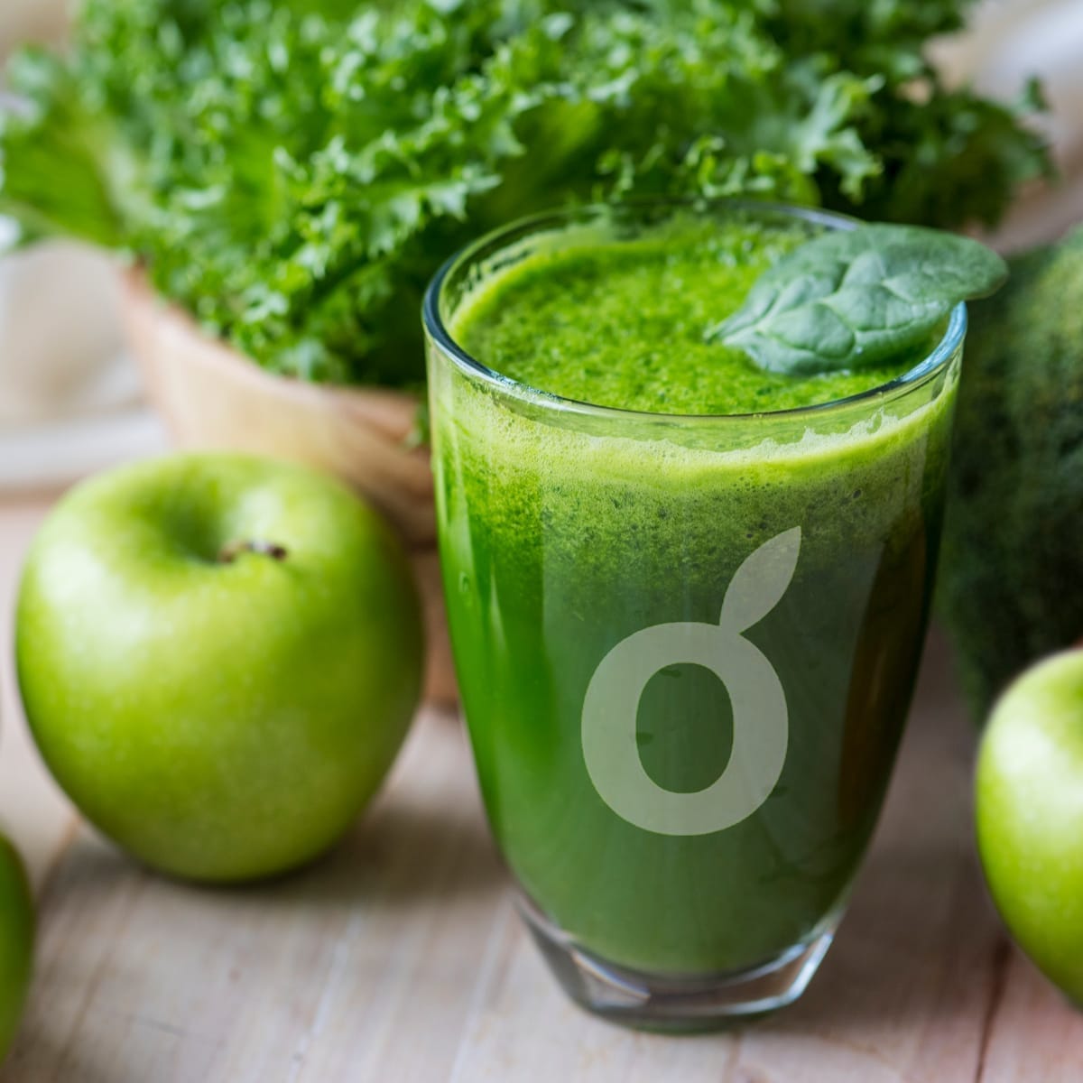
Freshly squeezed identity
The visual direction takes its cues from fresh produce: bold colours, layered textures, and fluid, organic forms inspired by fruit and vegetables. Clean, playful typography pairs with natural shapes to create a system that feels fresh, energetic, and honest. The overall effect is packaging that radiates vitality and makes an immediate connection with the consumer.
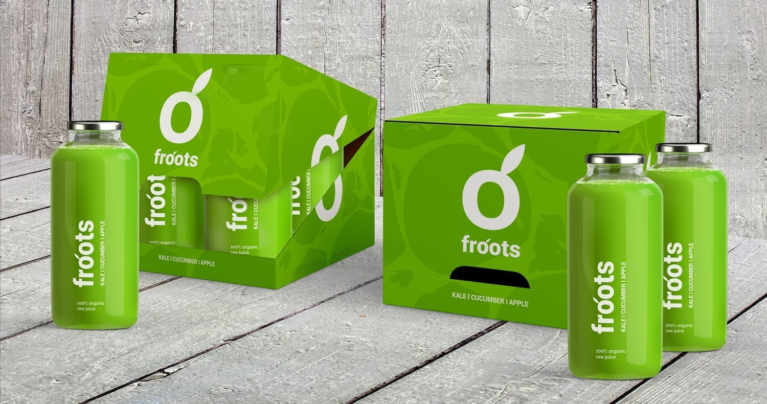
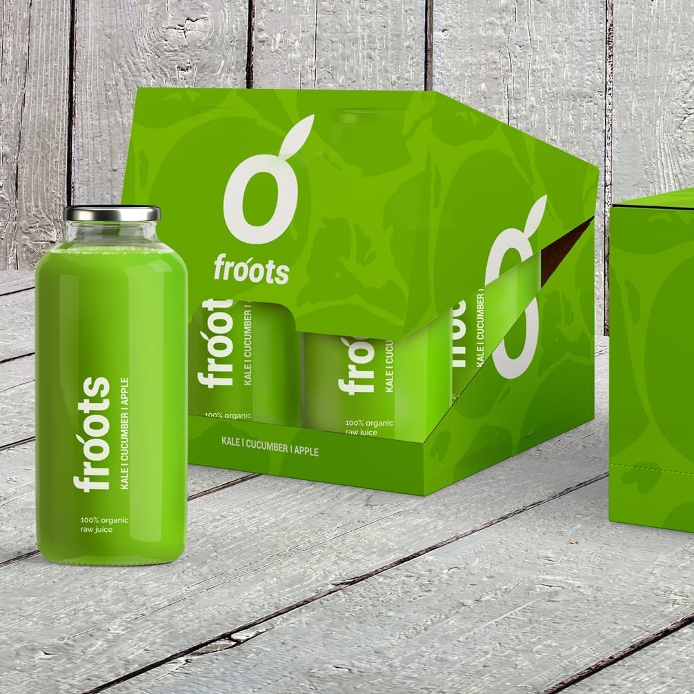
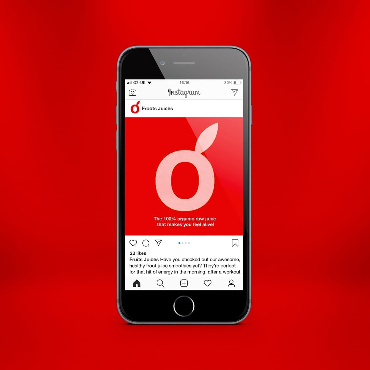
Brilliant, bright and retail-ready
The concept demonstrates how Froots could claim space in the juice aisle with a brand identity that is both vibrant and trustworthy. By combining natural freshness with clear, modern design cues, the result is a distinctive brand world that feels brilliant, bright, and approachable — perfectly positioned to stand out in the premium organic juice market.
Launch. Scale. Win shelf space.
Let’s take your brand where it belongs.

Helping you get your product onto shelves + into baskets.